People are increasingly relying on online shopping platforms, such as Amazon, eBay, Alibaba, and Taobao. Various online shopping platforms have brought great challenges to the traditional retail industry. In front of the situation of decreasing in-store traffic, it is important for brick-and-mortar stores to improve their visual marketing strategy to attract consumers. In this article, we will discuss how to make better use of the layout in the store.
Table of Contents
When designing the store layout, the location of the products should play a leading role in guiding customers to have a good shopping experience. Here are 10 effective layouts to create a pleasant shopping experience in your store:
Straight floor plan

The straight store layout is the simplest retail store layout, with cargo shelves on either side of the straight aisle. General small shops and convenience stores like to use this layout.
For the consumer, the straight store layout can make the target at the fingertips, but this way of placing the product equally cannot fully display the characteristics of the product, the shelf itself obscures the product and the customer cannot quickly find the product they want.
Diagonal Store Layout

Diagonal Store Layout’s advanced also applies to small stores. The diagonal Store Layout sets a non-orthogonal angle between the aisle and the shelf. Consumers can see the products on the shelves as much as possible through the aisle, as well as the diameter to the checkout.
This layout efficiently displays the product in a convenient customer situation, but the passage between the shelves becomes narrower. If the checkout counter is set higher, the checkout can also get a good view and improve the store’s damage prevention.
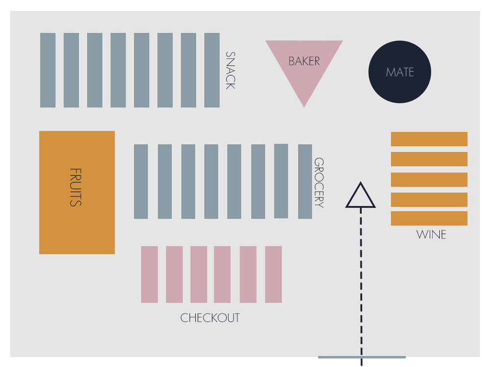
Grid floor plan

Grid Floor Plans, use freestanding linear fixtures, that create aisles and pathways within a retail space.
This layout is suitable for large retailers. Different commodity categories in the entire plane place in the grid area and the available area is efficiently utilized to place a large number of items on the shelves in a structured manner.
However, this layout lacks aesthetics, and there is nothing new, and it is not very attractive to attract customers. It needs to be used with eye-catching display stands or signs.
Forced-Path Layout

This layout has only one exit, and the path of shopping and browsing products can only go straight to the end. The famous furniture retailer IKEA uses this layout, which can display a large number of goods at the same time and has a huge passenger flow, which effectively increases sales.
This design can entice consumers to buy more but may irritate customers who want to buy specific things and time, they do not want to be forced to visit the whole mall because they want to buy a specific product.
Loop Store Layout/racetrack layout

It uses a path to guide consumers from the entrance to the checkout area, which enables customers to purchase the products they need quickly.
The layout of creative products in the store, the establishment of a creative display in the center of the store, and the most distinctive products or best-selling items in the Central store display.
Boutique store layout

The boutique store layout is the layout that luxury stores like. It divides the store into several semi-independent areas. The products are placed in the beautifully decorated partitions of the store according to the general category.
This kind of layout is clearly defined. A series of the same brand of products can be coordinated in the same partition, causing customers to be curious about the product. But this layout requires a lot of space, and the product display space utilization rate is not optimistic.
Angular Store Layout

This layout is ideal for high-end luxury goods, with a large number of curved walls and corners, and the soft angles make the merchandise one after the other in front of the consumer.
This kind of layout can effectively display limited products in front of consumers, leaving a deep impression on them, but the space utilization rate is not high, and cannot display too many products.
Geometric Store Layout

The Geometric Store Layout uses a large number of geometric elements. Retailers in the fashion industry like this layout very much. It can blend the design of the entire display space, the placement of goods, the irregular and unique corners, and the ceiling can be designed and utilized for artistic expression.
This kind of layout focuses on the marketing of the environment, which is very suitable for clothing stores. The requirements of the designer are high, the designer should understand the brand and use various elements to fully express the brand image.
Mixed Store Layout

Mixed Store Layout uses a combination of the above various layout elements to create a large retail store layout. The flexible layout accommodates a wide variety of products, giving consumers a wide variety of options when purchasing goods. At the same time, maintaining such a large layout requires a lot of space and a lot of manpower, and resources, which is a major challenge for retailers.
Free flow store layout

This layout allows for maximum creativity. The fixtures and display are positioned in a certain direction, encouraging consumers to slow down and increase their attention to the product. This layout is ideal for boutiques or high-end stores. If the storefront space is not a regular space, being freely arranged will make the store more characteristic to leave a deep impression.
